
Plus de nouvelles
- La certification ISO 3834-2 sera-t-elle obligatoire pour les machines à souder les poutres en H utilisées dans les projets d'infrastructure de l'UE en 2026 ?
- Highlight Review | L'exposition d'Essen s'est achevée avec succès, Zhouxiang vous donne rendez-vous à l'avenir !
- Zhouxiang vous donne rendez-vous au 28e salon d'Essen
- Robots de soudage vs. soudage manuel : Comparaison des coûts
- La Premier League écossaise bat son plein ! Découvrez l'esprit de Zhouxiang Enterprises en première division écossaise !
The use of steel structures allows the building to break through conventional limitations and begin to grow taller and longer like grass in spring. In recent years, a considerable number of steel structure projects have been launched, which has also driven the continuous development of the steel structure industry.
Japanese Prefabricated Steel Structure Housing
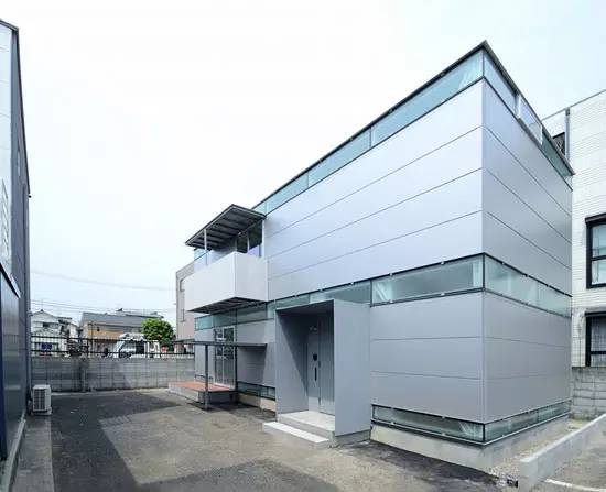
Lightweight rolled channel steel is lightweight and easy to transport and process. Niji Architects took advantage of the material's unique properties to create this "border house". The project is located in Tokyo, Japan. The houses all use steel structures, which are similar to typical wooden buildings to some extent. In the factory, the steel plates are cut, the holes are reserved, and the connecting hardware for each part is made. When the foundation is completed, all prefabricated components can be easily assembled together using specialized nuts and bolts.
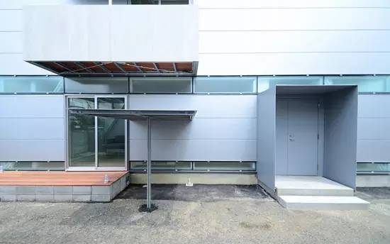
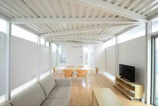
Thanks to the material's light weight, it can be moved by just one worker, so the frame can be assembled quickly. Because the load is small, piling is not required for the foundation, which also means that construction costs can be further reduced. The floor, walls and roof are all made of steel plates, which have enough strength and rigidity to be directly fixed to the frame behind. The exposed steel panels inside create a unique interior aesthetic.
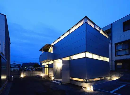
A cornice and balcony were designed according to the owner's needs and, like the rest of the structure, are connected with nuts and bolts. As a residential project, it is very different from the local surroundings and represents the taste and personality of the owner of the house. niji Architects considered strong privacy in the design. Windows surrounding the upper and lower parts of the building have been carefully positioned to create comfortable and rhythmic living spaces and quiet, private bedrooms.
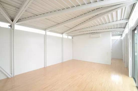
Japan Tb House
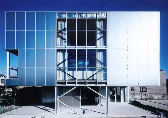
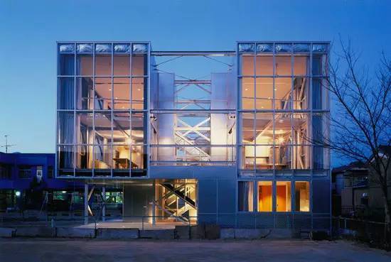
‘TB House’ designed by kikumi kusumoto of KS Architects is located in the western part of the city of Nagoya in Aichi Prefecture, Japan. The building is composed of three separate households, with use spaces spread out in a series of grid spaces within a three-story volume.
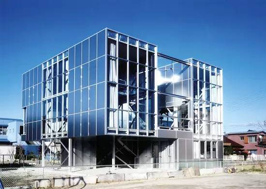
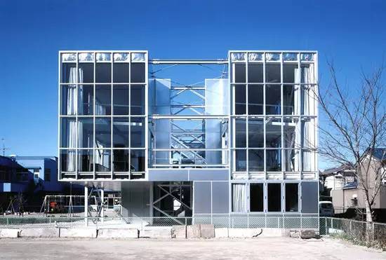
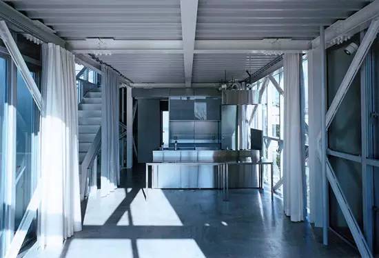
Ten people live in the house, and Kusumoto needed to figure out how to provide privacy within close proximity to home. By dividing areas into small frames - including public and private areas - the spatial distinction is made clear.
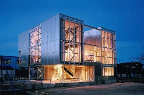
The exterior features multiple ground floor columns, patios, terraces and service courts, all of which are used to help emphasize the building’s permeability and bring its occupants into greater contact with nature. Some window panels can also be opened to ensure smooth indoor ventilation.
Chile Cero K Factory
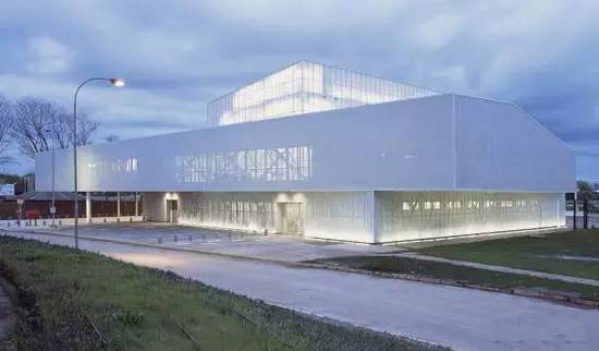
This is the Cero K factory designed by Max-A, located along Chile's Southern 5th Line between the cities of San Carlos and Chillán. The project was intensive and took only 4 months to design and 8 months to build. Iansa is a major manufacturer, distributor and seller of sugar in Chile. The company is looking for a new warehouse for its sweetened products.
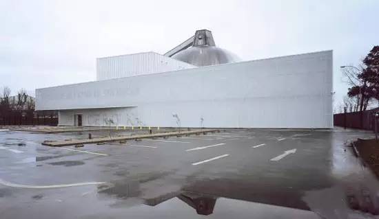
The warehouse has two floors, 8.5 meters high and 30x50 meters in size. Its original design was to arrange various functional requirements. The actual sugar production process is a central part of the project, so a 4-storey (14m) central structure was designed, clad in translucent Alveolar Sunlite polycarbonate, making it both a freestanding element and The function of condensing elements. The building appears to reference the purity of the dome and silo, two hallmarks of the sugar factory.
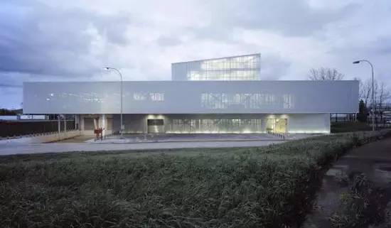
As if carved into the ground, the factory responds to both private and public circulation at different scales, including those of people, machines, sugar production or related transportation. The main warehouse skin mainly uses perforated composite steel plates to respond to the orientation and sunlight, providing sun shading and energy saving. The steel structure is toy-like, with its center connected to the surrounding structures.
Peruvian School Of Visual Arts
Project name: Visual Arts School
Architect: Barclay & Crousse
Project location: Lima, Peru
Project area: 2280㎡
Project time: 2012
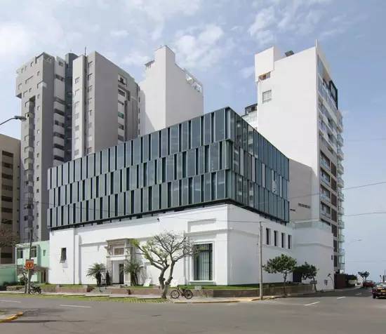
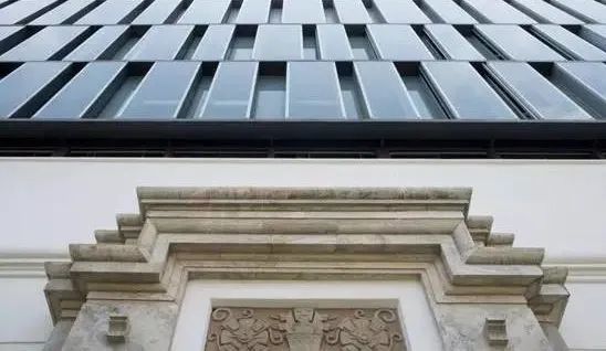
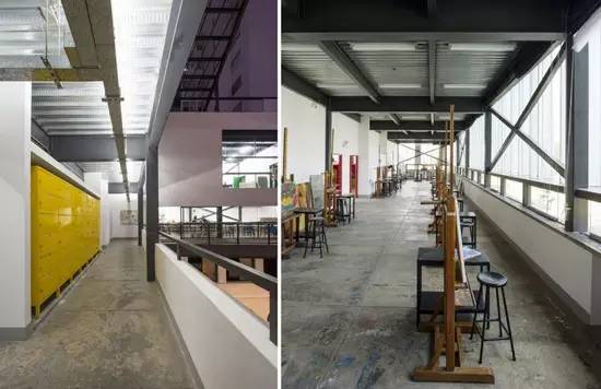
The architects chose a lightweight steel structure to meet the tight construction schedule, and the school continued operations during construction. The metal structure originally designed by P. Baracco supports the extension and gives the façade a light appearance, so that even though the visual weight is increased, the original building does not look overwhelming.
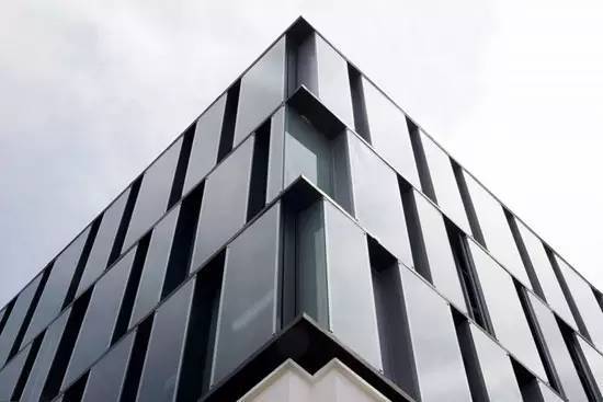
The glass skin brings a sense of free and casual rhythm, combined with the fixed tempered glass panes to create an interaction of light and shadow, and the natural aluminum ventilation device ensures proper ventilation. The ventilation units are available in different surface finishes (natural anodized and painted black), giving them an ever-changing appearance when viewed from different directions.
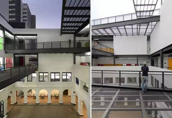
Two existing stairs inside the school extend vertically, and a metal walkway connects the two, passing through the original courtyard from the third floor, meeting the safety requirements for evacuation and fire and earthquake resistance. These walkways act as suspended courtyards, creating informal intermediate learning spaces between traditional courtyards and accessible rooftops.
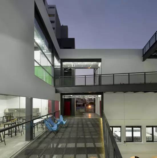
Large urban porticos located on the third and fourth floors open towards the city, echoing the corridors of the historic building.
Austrian Nick Office Building
The Nick Office Building is an independent building in a small square next to the Mur River. Its shape is like a pile of golden cubes. The design of Nickelodeon's office building involved complex and detailed considerations of technology, planning and finance.
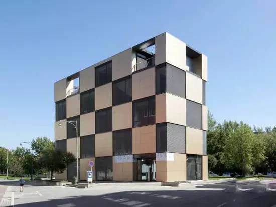
The first architectural problem to overcome was how to make the floor 2.5 times higher than the previous two-story storage room, but without the weight crushing the 1980s parking lot underneath. Designers solved this problem with lightweight structures and complex underground grid diffusers. Underground grid diffusers disperse the pressure on steel structural girders to support underground parking.
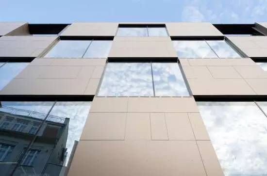
Before the 1980s, the parking lot was not built, and the small square was not redesigned. The Mur River in the small square was a shipyard in the fourth century. When the architectural style of Nikolaiplatz became obsolete, the base of the small square remained unchanged. The new building was designed exactly to the size of the site and responds accurately to the alienated urban environment.
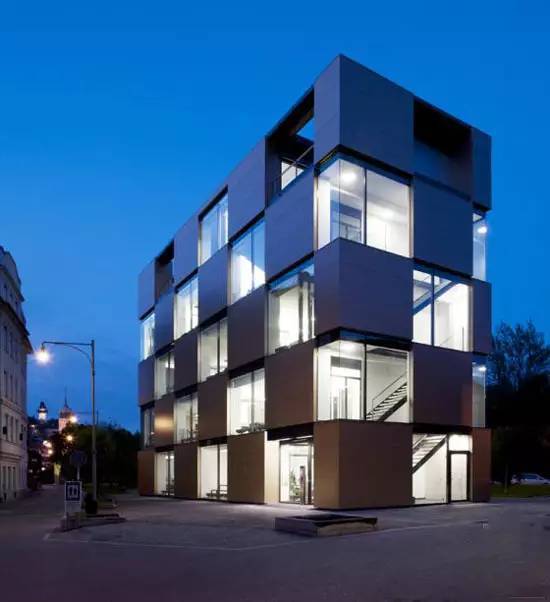
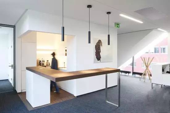
On the one hand, the Nick Office Building has become the dividing line between nearby buildings. On the other hand, the Nick Office Building has become a sculpture-like existence. The office building is a steel frame structure with clear layers and is supplemented by glass, which effectively alleviates the disharmony between dense urban areas and wide green fields. It looks simple and quiet under the shining gold. The interior of the squat-looking office building is also used effectively. The entire building is solid, functional and attractive, while also meeting aesthetic standards.
Canadian Lebourgneuf Community Center
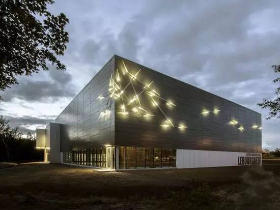
This is the Lebourgneuf community center located in Quebec City designed by CCM2 Architectes. The project is a central element of the community as it provides venues for activities and is located next to Les Prés-Verts primary school. The center is directly connected to the school and is the main partner in leisure, education and socio-cultural activities. The extension is a two-story steel structure building that includes a double-story gymnasium, two locker rooms and sanitary facilities, a divisible fitness room and classrooms.
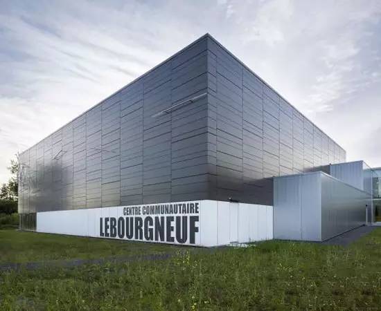
The design concept took into account the many constraints of the site, such as a mostly wooded area, a flood-prone area and future development of the school (school and local library, etc.). The extension also serves as a pilot study for accessible spaces.
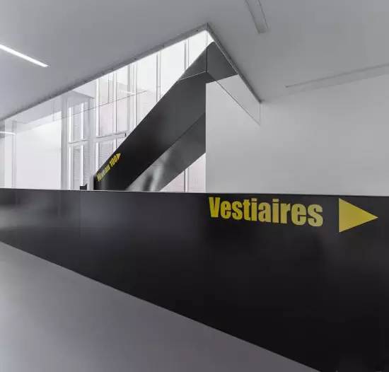
Every public space, circulation space, changing room and classroom is designed to meet the needs of people with limited mobility, people with low vision, the elderly or children who lack independence.

Zhouxiang Enterprise
Specializing in the production of H-beam light and heavy steel production line, box beam production line, horizontal production line, double-splicing welding and straightening automatic line, all kinds of automated customized assembly line; including CNC flame plasma cutting machine, fiber laser flat cutting machine, laser pipe cutting machine, tube and plate integrated machine, hand-held laser welding machine, H-beam assembling machine, gantry submerged arc welding machine, H-beam straightening machine, shot blasting machine, H-Beam assembly welding and straightening integrated machine, welding special machine, auxiliary machine, rolling machine, profile bending machine, various welding machines, etc,
Made by Zhouxiang, professional quality, high precision, high speed.
Leading technology, stable quality, products sell well at home and abroad.
